Affinity Data Art
Table of Contents
After I finished CS 171, I found Sonja Kuiper's A View on Despair and realized how powerful static, art-focused visualizations could be. I decided to do a few projects meant to develop my skills in a designing program, Affinity Designer (a decent alternative to Illustrator). These were meant to be low-stakes, experimental, and fun. For three months, I recorded some data of my life for a week and then spent some time drawing and designing the visuals in Affinity.
I wanted to visualize my coffee consumption, because as is traditional with me, it tends to skyrocket at the end of the semester.

Data Encoding:
Date - Header
Time coffee was made - Angle
Mug type - Center circle icon (0)
The cup number - Rings (1+)
Type of Coffee - Ring Color
The fate of each cup - Outer Ring Stroke
In my initial sketch, I had the center circle coding mug decoration category, but it was using color. I quickly changed it to icons upon realizing that having two sets of color encodings, though in different locations and with different pairs of colors, would probably still be confusing.
I choose to use icons over inner-circle line patterning (stripes, crosses, zigzags, etc) because the icons remove a level of decoding. Just by looking at the icon the reader would be able immediately know what decoration was adorning each mug, rather than needing to consult the legend again and cross-reference 'zigzags mean TV/Film'.
The ring gradients were a tough call, and I'm actually not sure I made the right one. I chose to use a gradient fading to white because: a) it represents qualitatively if not quantitatively the idea that caffeine lingers in the system but fades over time, and b) I didn't want all the rings to be fully saturated and converging on the 4pm/8am line. I thought that having solid block of color transitioning to white at the top might prove to be visually distracting. The reason for the doubt is that a friend interpreted the gradient as "the time I was drinking the coffee" and was confused as to why it took my 8 hours to finish coffee and why I'd make more having not finished the previous cup. Maybe this could be remedied simply by adding the gradient to the legend with the caption "caffeine present in system" - expect then I feel like it then becomes a Quantitative measurement of caffeine in system (which it's not because I have no actual measurements of this) rather than a visual suggestion.
Every year, I visit my dad after New Years for the holidays. Because there is a large conference right after New years for our field, I normally take a very short holiday break and spend most of the time working on my conference talk. So, in mid-January I visited my dad and we did our annual ski trip to Solitude. However, in early December I had sustained a herniated T1 disc from a rock climbing accident. I was on the mend and decided I was good enough to snowboard - provided I took it slow, avoided risky behavior, and did my best to avoid falls. I decided to record my falls just in case I did something that exacerbated my injury, though.

Data Encoding:
Day - Individual Main Lines
A fall - A single flair off the main line
Forward Foot - Whether the flair is coming off to the right of Left
Edge - Fill of the circle at the end of the flair
Difficulty of Run - Color of flair
Aspect of Fall - Stroke modifications
So, this one was fun to design. It came to me almost fully formed and I did very little in the way of modifications from my initial sketch.

First, a bit of a primer: In snowboarding, people have a dominant or forward foot and for the majority of the population, this is the Right Foot. The Right Foot goes in back and does a lot of the hard work. Consequently, the Left Foot goes up front. This orientation, Right Foot Back & Left Foot Forward, is called Regular. When this orientation is reversed, it is called 'Goofy'. I am a Goofy Rider, and so this means I ride predominantly with my Right Foot forward. Of course, the rider is able to voluntarily reverse their orientation so that they are riding with their non-dominant foot in the back. Regardless of whether the rider normally rides Regular or Goofy - when they choose to ride with their feet swapped, it's called riding 'Switch'. In the legend, by including only Goofy or Switch, I was hoping to indicate my normal riding style, which is Goofy, through the exclusion of Regular.
The data, however, is heavily skewed towards riding Goofy. As you can imagine, riding switch is harder and less intuitive, your body wants to have things flipped. Therefore, when I normally ride switch, I fall a lot more frequently. Since the goal for the trip was to not fall, I didn't ride switch very often or for very long. I wasn't sure how to indicate this seemlessly into the rest of the visualization, so I left this aspect out for the sake of clarity.
The flair colors match the run colors used at resorts, except for black, which indicates Difficult runs (green circle = easy, blue square = intermediate). By coloring the main lines black for that high contrast but making them utterly devoid of actual data themselves, I thought it wouldn't be an issue. Please correct me if I'm mistaken and you interpreted the visualization as me riding predominantly black diamonds.
And then of course, there are fun aspects to every fall (moguls, jumps, whether I rolled/flipped when I fell) that I wanted to include because it characterizes the fall itself. And it would be useful data to give the doc if any of the falls exacerbated my injury. I hope that by including these details in the flair design themselves, it would take the viewer along for the ride, so to speak, as they visually followed the flair from the main line to the end.
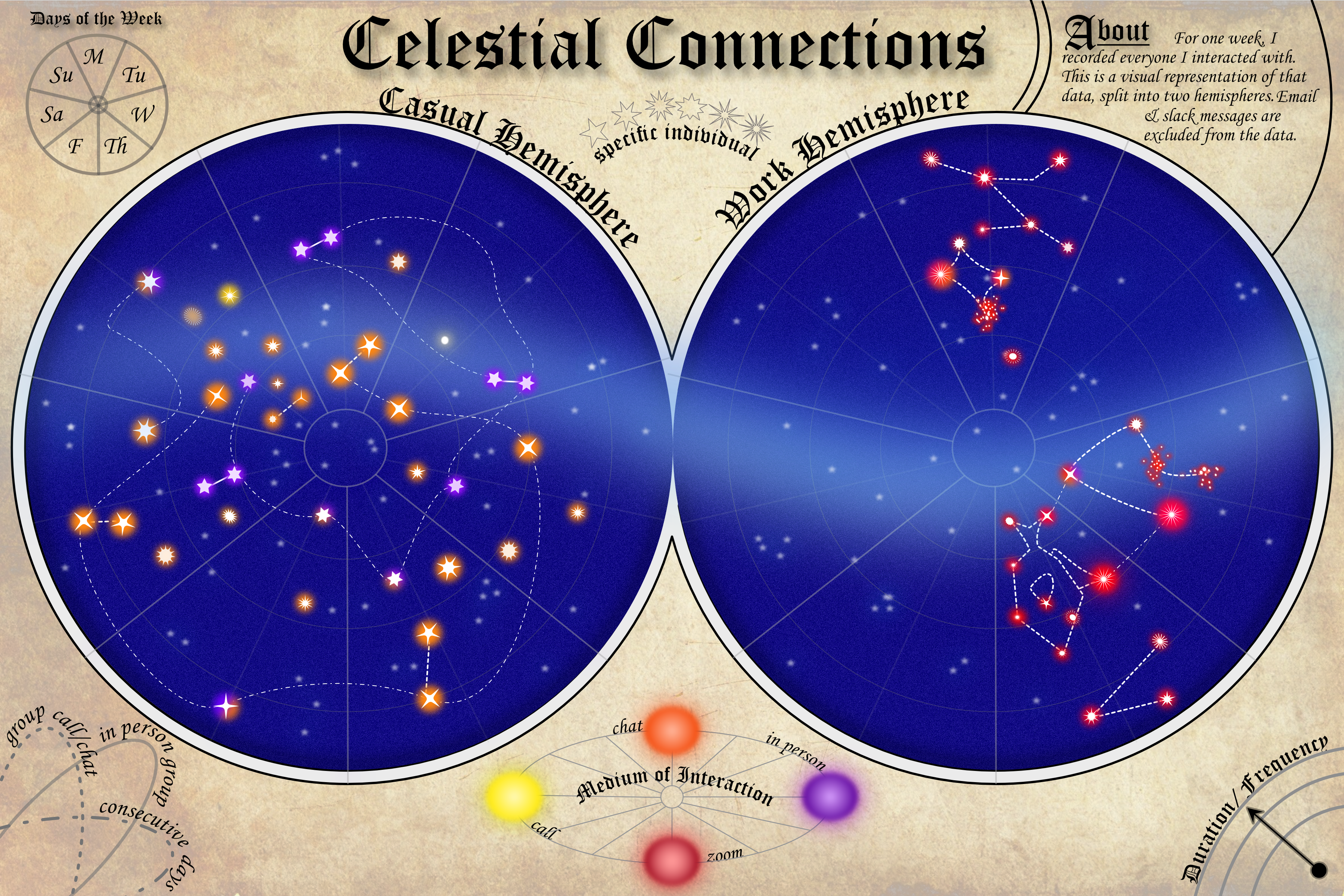
For February's data art project, I recorded everyone I talked with, the medium of communication (in person, zoom, chat [via messenger, text, DMs, whatsapp, etc], or phone call), and roughly how long we chatted/how many messages were sent relative to all the other conversations that day.
I was looking for a way to visualize this when I spotted the celestial chart hanging above my bed (yes, I'm basic), and decided I wanted to recreate it.

Data Encoding:
Hemisphere (left/right map): Casual conversation or work-related
Day of the Week: Section of the sky map
Person: Star Shape
Medium of Communication: Star's Glow, and if I connected with people through multiple mediums (e.g. chat and in person), then the glow would have both/all the corresponding colors.
Group chat/zoom: Dashed Line
Consecutive days of interaction: Dash-Dot Line
In-Person Group: Solid Line
Duration of interaction: Location from the center


I think the the biggest thing that jumps out is that I have casual conversations more regularly throughout the week, while my work-related interactions are rather day-dependent (e.g. I teach both class and lab on Wednesday). And some people I interacted with every day for the entire week (like my roommates).
I wanted to get that "constellation" effect in the night sky, and to do that I needed lines. I decided to visually group chats, consecutive days of communication, and if I saw more than one person in-person (kind of rare in the early years of covid). My roommates were the only one to fit that requirement, haha.
The only constructive feedback I got was that the "Medium of Interaction" legend might suggest placement is also encoded, rather than only color. Given that I was just simulating a piece on the original celestial chart, I hadn't thought about that, but something to keep in mind going forward. This piece was fun to make, and sketching it out to determine the encoding definitely took the longest of the three projects so far, which makes complete and utter sense as it's the most complicated thus far.